

Today’s Kona Cotton color of the day is Parrot. Parrot is a bright green.
It’s not an in-your-face bright green, but more of a happy green. And the color above in the picture seems much brighter than it really is. When I look at the color, I see the bright, but I also see something that says stable.
There are obviously many colors that could be blended with Parrot, from analogous greens, to reds/pinks complementary on the color wheel. So I tried a few combinations. And here’s what I came up with below.
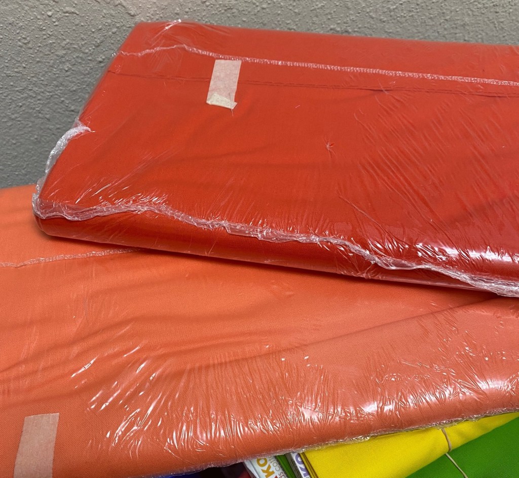
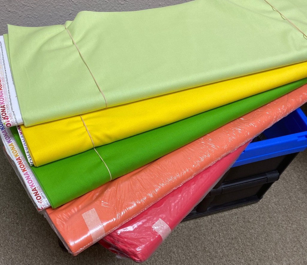
So here’s how I kind of went about this. I started with five colors: Watermelon, Ice Peach, Parrot (our focus color of the day), Citrus and Honey Dew. So I had a couple of dark colors and a couple of light colors for contrast with citrus being a medium color and parrot and watermelon acting as the darker colors (even though they aren’t REALLY dark).

I thought it was a pretty good color combination, but when you look at it, my eyes didn’t directly focus on the parrot (green); it was drawn to the citrus right above it and the watermelon (bottom). So I decided that adjustments needed to happen.
So I thought if I brought in an orange, it might balance it slightly better. At first I wasn’t sure if it should be a dark orange or a light to medium orange. So I looked at these: nectarine and flame.
The nectarine might work, but the flame was too much. It burned. Tee hee. Ok. Sorry about that. But it still wasn’t quite right because now the nectarine seemed to clash with the watermelon.
I needed to go back to the drawing board. It seemed like there were too many darker colors and not enough light colors to allow for some contrast. So we swapped out the Nectarine for Cantaloupe… I know… it’s all fruit to me! And we swapped out the Honey Dew for Blueberry.

So we had lighter colors enveloping the bunch, but the three colors in the middle just seemed so strong. We had to blend it together better and soften it some. So we changed out the watermelon for just plain ole melon, which seems to be a cross between a pink, a red, and an orange. But the color softened the combination and made for a better blend.
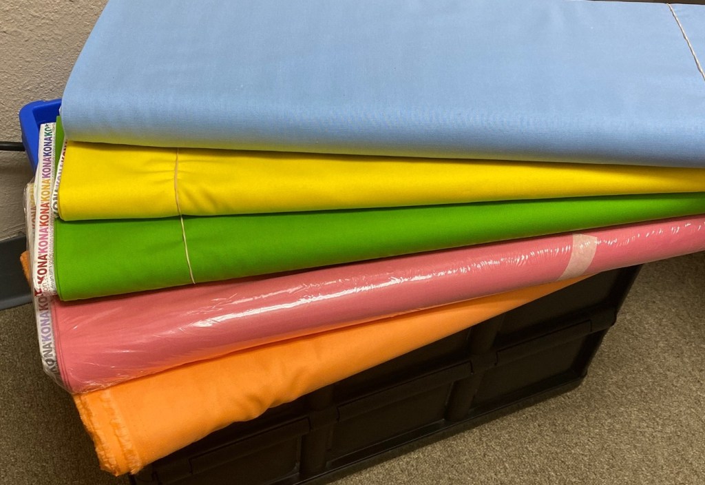
We still weren’t done yet, because that yellow was still too strong. We had to soften that too. But then if we softened it too much it might fade into oblivion and the rest will become muddied by themselves. We were also losing some contrast so we added black to see if that would offset the strength of the yellow.

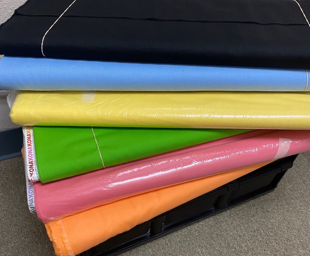
But the black, while adding contrast still didn’t tame the yellow. So we switched out Citrus for Lemon. This worked to soften the bunch. Now there is good contrast, the colors blend well working and playing nicely with others. They just needed a stronger playground monitor.
And here it is. The final bunch, including Parrot.
What has been your most challenging color combination? Let us know in the comments below!
If you’d like us to make a fat quarter bundle for you out of these colors, email us at info@sewcharmingquilts.com or call us at (469) 319-2800. Check out our website to see our fabrics on sale and new specials!
