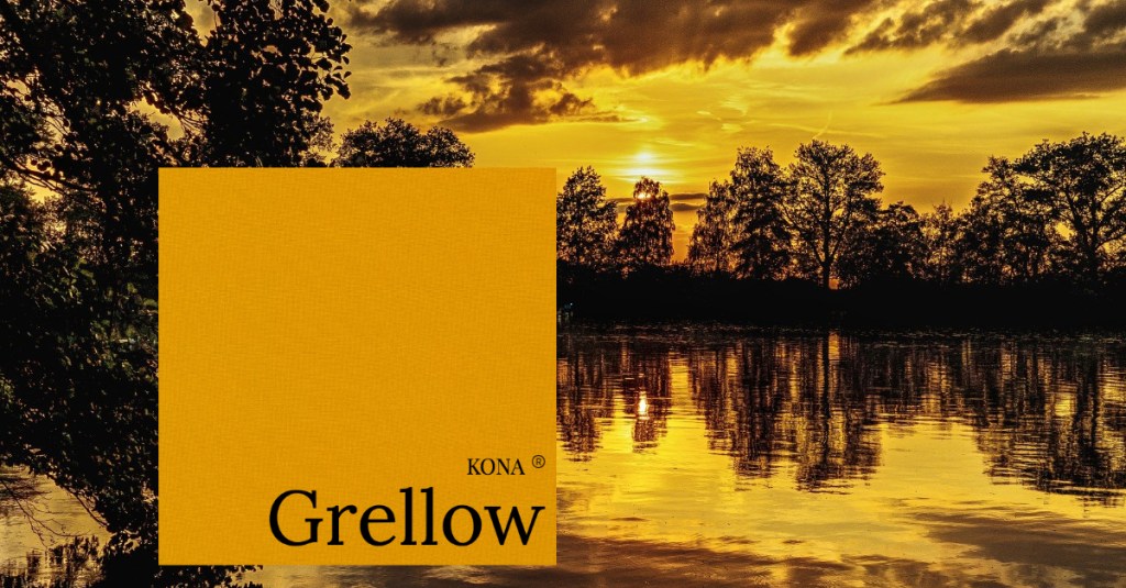
Today’s Kona Cotton color of the day is Grellow.
This color is one that is an enigma to me. I mean, grellow, does that mean green-yellow? If so, it has A LOT of yellow in it. If there is green in it, there is just a hint or slight amount to give the grellow it’s gold-ish appearance. But because of the green added the gold is not a rocking gold. It’s more of a sallow gold. To me, it’s an awkward color and how would you blend something with it? Speaking of blending or coordinating colors, we have a Facebook Live going on tomorrow at 10 AM (CST) to discuss how we can coordinate colors on the fly. Check out our Live event tomorrow on our Sew Charming Quilts Facebook page.
But now back to Grellow. The first thing we are going to do is whip out our color wheel. A color wheel is incredibly helpful when you’re trying to figure out what colors will go together. There are variations of hues, shades, tints and tones based on neutrals added to a color, but also variations based on colors next to each other on the wheel. Trust me, when you are REALLY not sure what to add, subtract or blend for color combinations, your color wheel is your BEST friend, as opposed to “Jack”, who can be the friend you love to hate.
So let’s speak specifically of Grellow for a moment. Grellow we know has a lot of yellow in it based on it’s goldish color. And it’s a medium to dark color. If we want our color palette to have good contrast, then we need to also think in light, medium and dark tones. If you aren’t sure whether a color is light, medium or dark, take a picture of your colors side by side. Then edit your photo to be in black and white (most phones can do this; some computers too). Any fabrics looking light or nearly white are light colors, any fabrics looking grey are medium colors and any fabrics looking black are dark colors. Some colors you think are medium end up being dark and some light colors end up being medium so they can surprise you.
Now we look on our color wheel for complementary colors. Yellow’s complementary color is purple. It is directly across from the yellow on the color wheel. So we will add in a little purple shades to complement the yellow. But we know it has a tiny bit of green in it so we will add a little red to the group and also to the purple to blend it well. Red is on the opposite side of the color wheel from green. Since Grellow is on the darker side of medium, we will mix it up with light and dark. Just so you know, you can also add other colors of yellow and green that are considered analogous (right next to each other) on the color wheel to make it more cohesive. Here is what I came up with that I think will blend well with Grellow. See it below. I added, Basil, Orchid, Eggplant, Ballet Slipper and Maize. I think they work just wonderfully.

But it doesn’t have to be limited to complementary colors mostly. We can also coordinate some neutrals with Grellow too. See below. We blended it with Black, Chestnut, Earth, Caramel, Cobblestone, Seafoam and Yarrow. And they work well together for a very down-to-earth color palette.
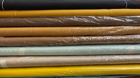
There is enough yellow and brown in the Yarrow and Caramel to be analagous to the yellow in Grellow. Chestnut, Earth and Black add the darkness coordinating with the neutrals in the browns. Seafoam adds the hint of the green but on a lighter scale that coordinates beautifully with the lightness of the Cobblestone.
Don’t be afraid to color coordinate. Get a color wheel that will help you blend with confidence.
What’s on your color palette today?
